Environmental Science & Technology · 2024
Urbanorrural?
Where do we draw the line?
Places form a continuum.
The definitions we choose divide it.
Conceptual landscape.
The question
The landscape stays.
The labels change.
Population, buildings, commuting and light at night describe different aspects of a place.
Which one we use can change where we draw the line between urban and rural.
Nine indicators and three classification schemes,
tested in Virginia and West Virginia.
Virginia & West Virginia · Global quantile
One region. Different definitions.
Population size
How many people live in a census tract?
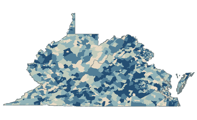
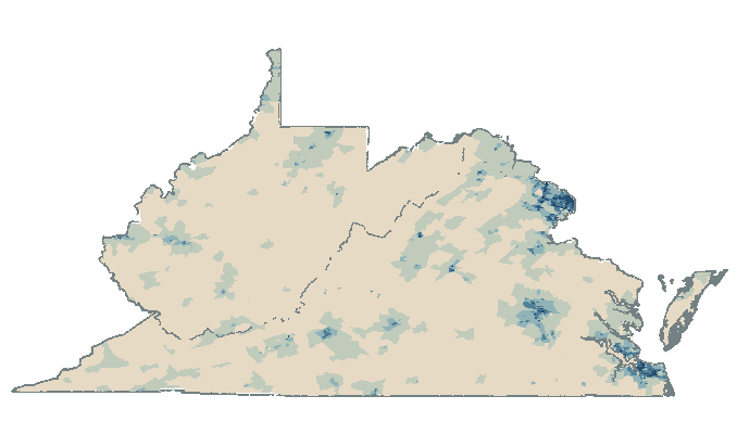
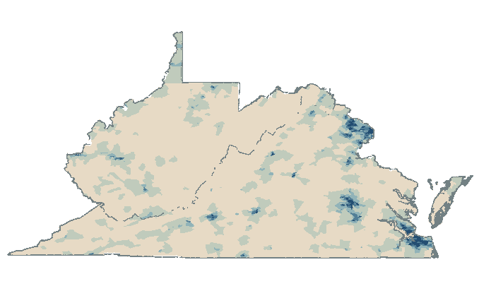
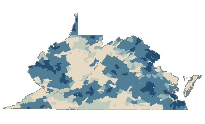
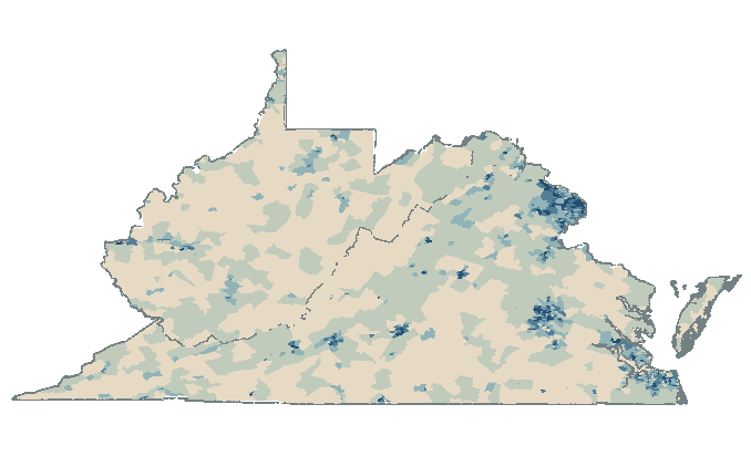
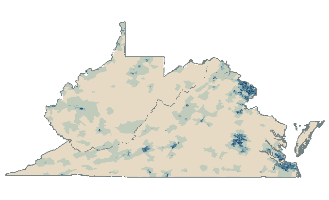
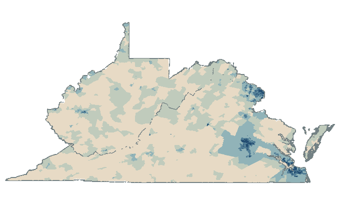
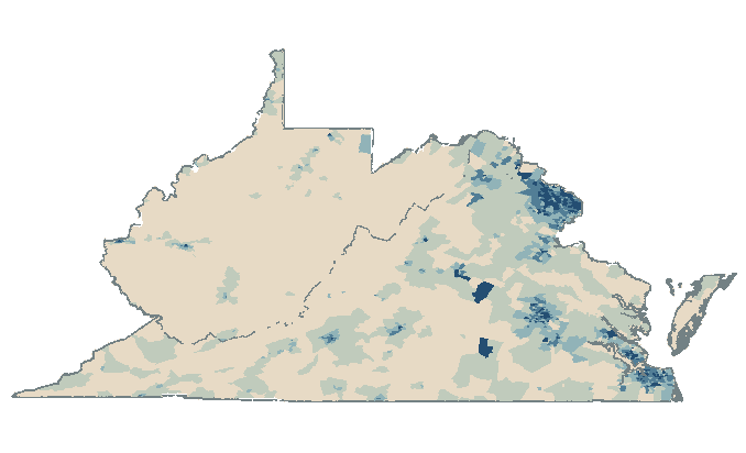
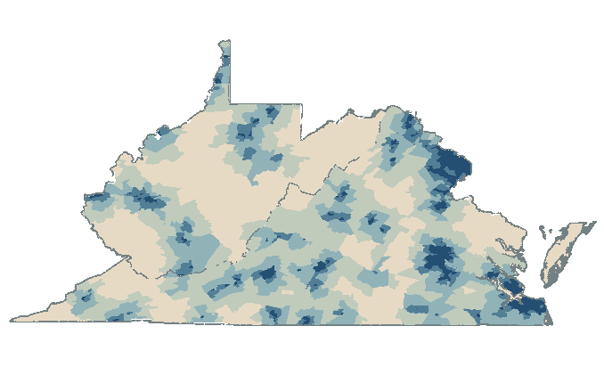
Scroll through all nine indicators, or select one above.
Source: Song et al. (2024), Fig. 2.
Population classified as urban
Who counts as urban?
Under global natural breaks, different indicators classify very different shares of the population as urban.
Population size
73.61%Population density
11.49%Distance to urban areas
93.76%Virginia & West Virginia · Global natural breaks · Fig. 5b.
Urban includes the moderately, highly and very urban classes. The maps above use global quantile instead.
West Virginia · Mean PM2.5 exposure · 2000–2016
Which has higher
PM2.5 exposure?
With the pollution data held fixed,
changing the urban-rural definition reverses the comparison.
Higher PM₂.₅ in rural areas.
Difference: 0.28 μg/m³
Scroll or select a definition to compare.
Census-tract averages · Global quantile · Fig. 6b.
The implication
The definition is
part of the finding.
Exposure comparisons need to be tested across alternative urban-rural definitions.
In this study, the choice affected comparisons of PM2.5, greenspace and land surface temperature.
Explore the indicators and classification schemes
- Population size · TotalPop
- Population count within a census tract.
- Population density · PopDen
- People per square kilometer.
- Commuting patterns · RUCA
- Rural-urban commuting area codes based on population density, urbanization and daily commuting.
- Nighttime light intensity · NTL
- Mean satellite-observed NPP-VIIRS nighttime light intensity within each tract.
- Points of interest · POIDen
- Number of OpenStreetMap points of interest per square kilometer.
- Urban area coverage · UrbanC
- Share of a tract within U.S. Census Bureau urban areas.
- Building coverage · BldgDen
- Share of a tract covered by OpenStreetMap building footprints.
- Road density · RoadDen
- Road length per square kilometer.
- Distance to urban areas · DisUrban
- Shortest straight-line distance from a tract’s geometric center to an urban-area boundary.
Global quantile: five classes with approximately equal numbers of tracts, using thresholds shared across both states.
Global natural breaks: groups of similar indicator values, with thresholds fitted across both states.
Local quantile: quantile thresholds set separately within each state.
The research
Delineating Urbanicity
and Rurality
Impact on Environmental Exposure Assessment
Yimeng Song · Nicole C. Deziel · Michelle L. Bell
Environmental Science & Technology · 2024
Read the paperMaps are approximate reconstructions of Fig. 2.